Making an Android Icon Pack.
My journey to creating cool icons for an Android launcher I love.
I love intelligent software and try to get my hands on anything that's even slightly advertised as "artificially intelligent".
One day, I met one of the designers of Aviate, the intelligent Android launcher that recently got acquired by Yahoo. He showed me his product and I instantly fell in love with it. For me, it was Android's answer to becoming even more awesome.
What Aviate basically does is learning certain key information from your habits (eg. where you connect to Wifi or input your home/work address) and hands you what apps you would need the most throughout your day at particular times and locations. I wouldn't be surprised if it were get a ton of information from the existing userbase to get an approximation of which apps people use at certain time and places.
Combined with Google Now, a sexy SwiftKey, and a new car-kit, I feel like I am in the Starship Enterprise everytime I step into my car.
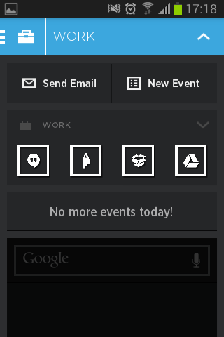
This is why I tried designing my own icon pack for this launcher, so I truly feel like I am navigating a spacecraft!
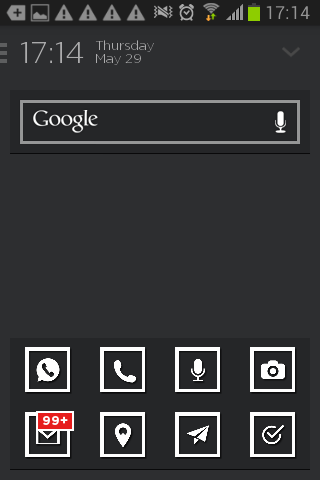
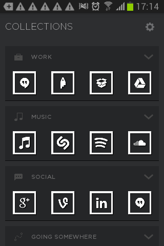
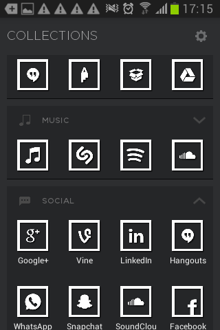
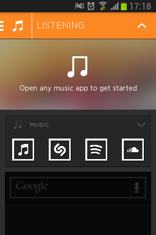
The idea was to keep things simple and play around with iconography and simplify existing apps' logos into icons. For the more generic ones, I tried reverting to something that was as intuitive as possible.
Some of them turned really well, like Soundcloud, LinkedIn, or voice search. Others might need some calibrating. Overall, I really like how the simplicity and homogeneity makes notifications really pop out!
Here are some screenshots:
If you are interested in how I managed to do it with very little Android app design knowledge, check out this source by xda-developers.
